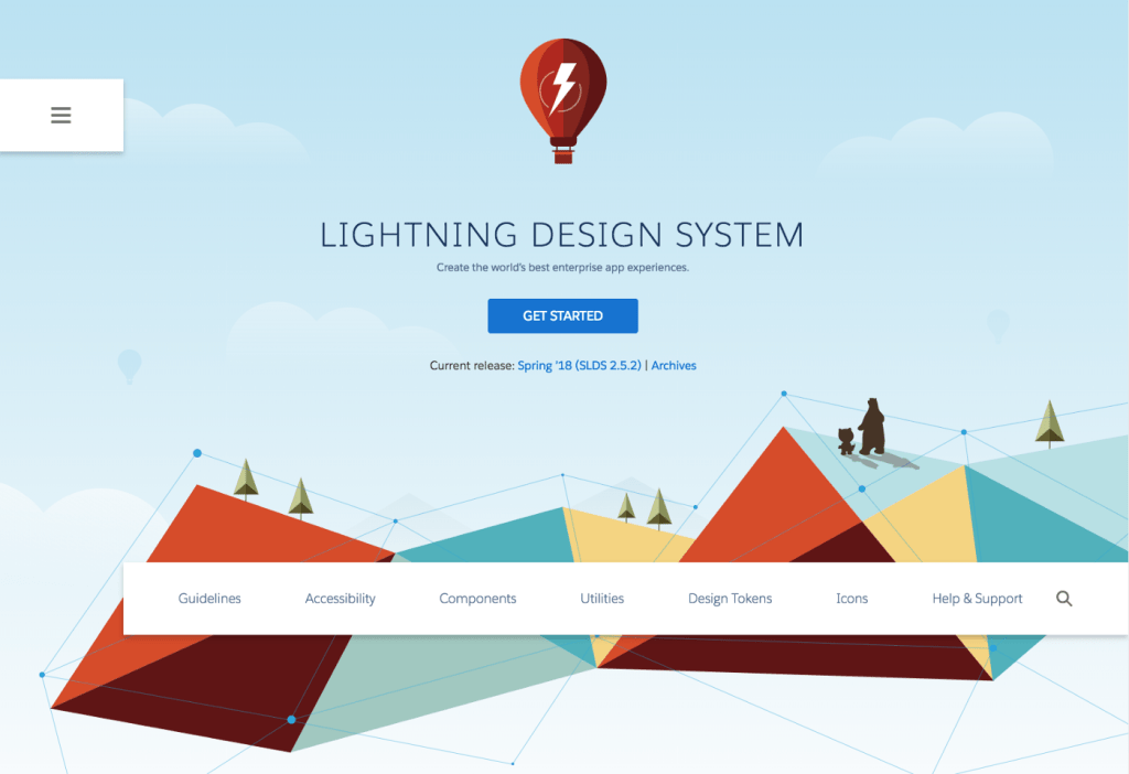
Have you ever wanted to capture a little bit of lightning in a bottle and take it home with you? That is, do you need to code an application off the Salesforce platform but maintain the same look-and-feel? Design System React encapsulates the markup and user patterns of more than forty of the components from the Salesforce Lightning Design System (SLDS) for use in any application compatible with React.
User-centered engineering at scale
User-interface libraries scale well. Although they can take more time initially, they result in less time spent on development and an increase in longstanding efficiency due to their re-use. Their encapsulated complexity, micro-interactions, and consistency pay dividends down the road, since the consuming product designer and engineer do not have to conceive every component state from scratch.
This project was an outgrowth of multiple user experience engineering teams and began as a way to quickly prototype features and conduct product research. Thus, user experience and standardizing on clear UX patterns is part of the code review process. The UX teams still use it to prototype demonstrations for customers and to iterate through ideas, but this library has grown to be used by many other teams across Salesforce. You can read through some of the lessons we’ve learned in the Codebase Overview.
Why React?
It’s functional. From a technical standpoint, it has deterministic renders and it abstracts the view layer away from direct DOM manipulation. At Salesforce, we have a mix of technologies that shift — especially when new acquisitions come onboard. One of the benefits of using React was that it was presentational and declarative — that is, it’s more of a library and less of a framework, so it could be more easily added to existing projects. Use a little or use a lot. Design System React will soon fully support ES modules and tree-shaking — so you can use only the components you want in your project.

Markup, data, and events encapsulated
HTML and CSS alone have thousands of touch points that may need updating in the future. Implementing JavaScript components encapsulates markup, data and user events into clear patterns that empowers developers to focus on shipping features.
This library embodies the Salesforce Lightning Design System’s interaction patterns with thoughtful defaults and examples. Any engineer that has been handed a design specification knows it’s one thing to implement a UI in a static state, it’s a whole another to ask what happens if the user does X, Y, or Z. What does this UI look like then? As with any living design framework, its manifestation into reality informs the interaction guidelines that birthed it in a virtuous cycle of feedback. In order to iterate, you have to tinker and test the component and see what experience feels right.
Accessibility from the get-go
At Salesforce, we value empowering everyone to succeed — especially when it comes to using software. Design System React helps create an experience that can be enjoyed by all users, including those with disabilities. Accessibility is a growth area for many front-end engineers — even ones that have been around a while. An accessible component library allows product engineers to more easily add accessibility to their application.
Be on the look out for more Design System React posts in the future, I hope to write a few deep dives into components that focus on thoughtful accessibility patterns and well… focus(). Can’t wait? For some great posts on accessibility, check out the Salesforce UX blog.
Open sourcing
We wanted to provide an open source path of implementing SLDS markup and CSS, standardized UX patterns, and accessible implementations for our own software vendors and to the greater open source community.
It also didn’t hurt that open sourcing made it available to the wide variety of technology used internally. The library has always been inner-sourced within the company with a distributed set of contributors with the maintainers focusing on code reviews, any large-scale refactoring, and improving the developer experience. If you’d like to contribute and be a part of the Salesforce Ohana, we accept any components or features that exist in the Salesforce Lightning Design System.

Let’s get started
You can view and play around with interactive examples at react.lightningdesignsystem.com. To start using it today, install SLDS and Design System React in your project:
npm install @salesforce-ux/design-system @salesforce/design-system-react
For a no build configuration React app framework, you might try Create React App. To add a simple button add the following to CRA’s src/app.js.
import { Button } from '@salesforce/design-system-react';<Button label="Hello Button" />
Do you use Heroku? There’s a Create React App Heroku Buildpack that will come in handy. Please review the readme for icon usage and more setup details.
Follow us on Twitter: @SalesforceEng
Want to work with us? Let us know!


