This post is part of the Observability 101 series. The series covers basic ideas behind monitoring and observability and, I hope, it will help engineers to make their products better prepared for a long life in production.

We found an interesting problem recently with some of the metrics in our product: we noticed pretty long intervals of absolutely flat lines on charts for a high percentile of a latency metric. We also saw the same pattern on a few other charts.
Here’s an example:
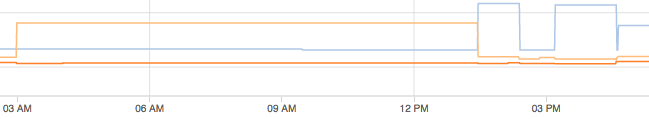
It is possible to see such lines but not for latency. And it’s absolutely impossible to have sequences of exactly the same numbers. This pattern was found only on clusters with sparse traffic: data arrives in batches from time to time, and there are gaps with no data incoming. These periods of inactivity were the key that helped us solve the mystery.
It was “fine” when after the last minute of activity the metric was at low level and remained there for some time, but if it was high enough, it triggered false alarms about high latency in the system. Nobody loves false alarms.
We use Dropwizard Metrics in the product. Timers in the framework are based on Histogram. The histogram metric stores data samples using a Reservoir. Data from the reservoir is used periodically to compute percentiles, minimum, maximum and other characteristics of the data distribution which represents the metric.
The default implementation of reservoir in the framework is ExponentiallyDecayingReservoir. If you love reading white papers then here are details about the sampling method it uses. If you fall asleep in the middle of the first paragraph while reading scientific papers, then here’s a hint about what was the problem is: the ExponentiallyDecayingReservoir stores data samples for some time. When new samples stop arriving it uses the historical data and returns the same characteristics for the data distribution again and again, simply because the data distribution doesn’t change. Such logic makes sense in many cases, absolutely. Unfortunately, our plan was to watch distribution for the last minute only. So the solution was obvious: switch from the default ExponentiallyDecayingReservoir to a sliding time window reservoir with the size of the window set to 1 minute.
Dropwizard metrics include 2 implementations of this kind of reservoir: SlidingTimeWindowReservoir and with version 3.2.3 SlidingTimeWindowArrayReservoir was added. The latter is a more efficient drop-in replacement for the first implementation: 4.2x lower latency, 2.5x faster writes, 3.5x faster snapshots, and 40x less time in GC. You can find more details in this PR where the array-based reservoir was introduced
By adding 1 parameter into the constructor of Timer — new Timer(new SlidingTimeWindowArrayReservoir(1, TimeUnit.MINUTES)) instead of just new Timer() — we got perfect charts with numbers for those minutes when there is some traffic and zeros when there is no traffic.
Conclusion
The main lesson learned: defaults aren’t always the right option.
As Captain Obvious would say, it’s better to understand what you want to achieve and how the tools should be used to help you with that.
But in the real world, if you can know everything about all the tools and frameworks you use, perfect, do that. But if you’re like most of us and can’t remember everything about everything, then every time you work with metrics and charts ask yourself: what should the metric look like? If it doesn’t fit into your mental model, then try to dig a bit deeper to understand what’s wrong, the mental model or the metric. It doesn’t take too much time, but this continuous analysis helps me and my team quite often.
The Observability 101 series includes posts related to monitoring and observability. Stay tuned.