At Salesforce, we use Zipkin to perform distributed tracing for microservices. The Zipkin tracing data (called span) can provide performance insights in both production monitoring and pre-production testing. However, the current Zipkin open source instrumentation and UI offers only primitive data tracing functionality and does not have in-depth performance analysis of the span data. The purpose of this project is to use machine learning approach for deep analysis of span data. The data we use in this study is functional and performance tests in pre-production staging environment. Several potential network bottlenecks, microservices performance issues were identified in our studies. Additionally, we also inspected the current coverage of our Zipkin instrumentation.
1. Methodology
Zipkin is a distributed tracing system that generates timing data recording the request and response data within microservices calls. The client instrumentation is done via an internal library, any services who wish to be traced can implement this library. The current sampling rate is 1% to save amount of span data generated in the system. The Zipkin spans are then stored in Elasticsearch. In this excise, we export the production tracing data into a separate Elastic search instance for off-line process. We used python Elasticsearch library to queried the data and used the Machine Learning libraries such as Numpy, Pandas, Networkx, and Matplotlib to analyze the data. Then we used a Jupyter Notebook to display and visualize the results. The goal is that through analysis of this data we will be able to identify latency issues in the network and bring greater visibility to these problems.
2. Calculating Completeness Metrics on Trace Data
First of all, we want to examine how well the zipkin tracing coverage within Salesforce microservices. Since Zipkin is currently under development, it would be good to examine the percent completeness of traces in order to measure how well we are doing the tracing job. The completeness of a trace is defined as the percentage of the root span that is traced. In the following example, the sum of all sub-spans (50ms+30ms) divided by the length of root span (100ms). the completeness is 80%, i.e. some sub-spans are missing for tracing.

Completeness of the root span is important because it measures how well we are doing in trace instrumentation completion. Ideally, we want the microservices in production to be 100% traced. This analysis gives an overview of trace completeness and their distribution. This will help the instrumentation team and microservices owners to be aware that there are still works to do. The following is one of the examples of trace completeness metrics for a given 24-hour span data in August.

As we can see the majority of traces are currently at 60–90% range. This indicates that not all microservices in the system are being traced. This metrics can serve as a dashboard to measure the tracing completeness as the instrumentation of distributed tracing matures. We would like to see rising completeness trends with time in our microservices network.
3. Identifying High Traffic Areas in the Network
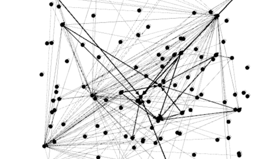
Another use of distributed tracing is the ability to plot the microservices call graph to visualize the network topology. Following network graph is one of the examples we draw based on parent relationships of span data. In this network graph, each dot represents a microservices endpoint. The lines between microservices are weighted based on the number of connections to and from those microservices. It is quite obvious to visualize the high traffic areas within our production network topology.
The top three services with the most connections are identified by their hosting IPs. They have 48, 46, and 42 connections to those services respectively. This finding is helpful feedback to the architecture design of those microservices, as those services with too many connections may potentially become choking points in the system design. If one of the above services fail, there will be a huge impact on a large number of depending services. Additionally, there could be also potential performance impacts in the system since a large number of services depending on them. Those are valuable information for system designers and architect to optimize their designs.
4. Identifying Services with Exponential Latency Growth
Next, we want to identify those individual microservices that may have performance problems. The performance problem is defined as the response time with exponential latency growth when load increases. The methodology we use begins with filtering spans by microservices, and then further filtering the spans that were generated as a result of a request from a calling microservices. Then we can generate two datasets, one of which describes the number of spans generated per second (load), and another which describes the latencies of each of those spans per second(average latency duration). Since we have two datasets with the same timestamps, so we are able to merge them into one plot, i.e. the load against the response duration. However, since the current sampling rate is only 1%, we found the raw plot is very noisy. Hence, we take the logarithm of average latency and plotted again with the load. If any service with their logarithm response time has a linear relationship with load, we identified the services with potential performance problems. Here are the formulas we used:
y=C·a^x
log(y) = log(C · a^x) = log(C) + log(a^x) = log(C) + x · log(a)
Let y ̃ = log(y), b = log(C), m = log(a)
y ̃ = m·x+b
Now that we have converted an exponential data set into a linear data set, we compute a Pearson correlation on this data and filter for high correlations. To calculate the Pearson correlation we used scipy.stats.pearsonr which returns a tuple of size 2. The first element of the tuple is the Pearson correlation coefficient. The second element of the tuple is a p-value that indicates the probability of an uncorrelated system producing a dataset that has a Pearson correlation at least as extreme as the one computed from the dataset. We analyzed the microservices with a high load that were identified in the previous section and used the above methodology to identify the relationship between load and latency. From this analysis, we identified several microservices that showed exponential growth in span latency with load. Following graph is one of the samples of such microservices:

Please note that in the x-axis, the load (r/s) seems to be low because the sampling rate is only 1%. The analysis of distributed tracing data has allowed us to identify potential chocking points at high load situation. We can use this information to reach out to service owners to improve their algorithms and work on troubleshooting these latency issues.
5. Conclusions and Future Development
Analyzing microservices Zipkin tracing data allow us to identify network congestion, bottlenecks, efficiencies and the heat map in the production network. We use Python AI packages to analyze the data because the current Zipkin UI does not have such capability. We suggest that those features can be added to Zipkin product line, including UI and dashboards. capability for daily metrics on a correlation between microservices load and latency and to be able to generate alerts if bottleneck or heat map is identified. These data analysis not only can be used in production performance monitoring but also can be used for debugging and problem-solving.
6. Honorable Mentions and Thanks
Thanks to Andrey Falko, Ryan Michela and many people from Big Data Monitoring Cloud for their feedbacks and contributions.


